2011-09-06

Paul & Joe Spring Parasol Collection 2011 Pouch review

I'm a huge fan of the various new Paul & Joe prints from each season, especially when they release pouches in the same print!

This is the pouch from Spring 2011 Parasol limited edition collection. Most of the time when Paul & Joe makes pouches like this shape, it comes with a matching small zipper pouch in the same print which is totally adorable!

The pouch is around 20cm length and around 14cm height, it's probably more a clutch than a makeup bag or other usage.

I use the mini zipper pouch for putting little things like coins etc. I use Paul & Joe pouches when I go to weddings etc, they always look great with various dresses.
The Spring 2011 one comes with a baby blue lining inside. When you open the pouch it looks like this, spacious enough to put a mobile, small digital camera and my concealer, small compact foundation powder and a lipstick and some tissues. That's all I really need when I attend a function.

I'm not sure what the material is- doubt it is real silk. However it feels wonderful and quite silky, does not look cheap at all in real life.


 Close up of the print and the corner, which will have a small Paul & Joe tag.


Overall I give it 5/5. Obviously the print varies from year to year and sometimes they do sell out quickly. However sometimes some countries seem to get a lot more pouches than others and instead of buying it, it is often part of the GWP when you spend a certain amount.

Jill Stuart Summer 2011 Blush Blossom #07 Charming Lily swatch/ review


Part of the Jill Stuart 2011 Summer limited edition collection is the #07 Charming lily Blush blossom, which is basically a loose powder blush in compact form.

 Again, housed in a gorgeous silvery compact with double deck. The top deck is not for storing anything, but rather it's a separator for the bottom deck which houses the loose powder blush.

The blush is housed under a mesh with a little bit bounce, you do not remove the mesh or the plastic separator, Instead you just dip your blush brush on either side and apply as needed.

Here it is swatched under different lights etc, on left is the highlighter side, middle is the blush on its own, on right is when mixed together:

The highlighter side is a finely milled champagne, it's got a pretty delicate gorgeous sheen, not massive shimmers or sparkles, but a nice sheen. 

The blush side is a brightened pink, it's not neon or anything, but just a pop of pink. It's a bit of those 'baby doll' pink face blush. It has a similar sheen to the highlighter shade, it's not just a matte finish.

When mixed together you will get a softer pink sheen which is toned down a fair bit more than using the blush side alone.


Now here's #07 Charming Lily on the left, and #06 Little Anemone on the right (from Spring 2011).
There is a pretty subtle difference only, #07's highlighting shade is a champagne nude while the #06 highlighter side is more like a soft pink tint.

The blush side of #07 is a brightened pink, slightly more pop of pink than #06's blush side which has a softer pink tone to it. While there is a difference, I don't really think you need more than a few shades out of the blush blossom as once you mix the shades together, more or less they are going to be similar.


Overall 4/5. They are still a bit inconvenient to use due to the loose powder consistency. You have to becareful when you open it to make sure you don't accidentally tip this over or anything. It retails around 50-55USD in Japan, (however consider you do get a quality retractable brush with this). That being said, these are the most gorgeous loose powder blush I've used for sure. They are super finely milled, has a soft sheen to it rather than massive shimmers or sparkles, which makes both shades very wearable.

2011-09-05

Jill Stuart Summer 2011 Jelly Eye Color N #14 Dazzling Tear #16 Romantic Cat swatch/ review

Jill Stuart Jelly Eye Color N #14 Dazzling Star and #16 Romantic cat are from the summer 2011 limited edition collection.
Jill Stuart Summer 2011 limited edition collection comes in an array of small items, from the gel eyeliner and new brushes, to the 2 new shades of Jelly Eye Color N (might be 3- there's a #15 inbetween 14 and 16 but I didn't see it ), plus the new blush duo in #07 charming lily and lipgloss in #21 dreamy paradise.

Here's #14 dazzling star. Comes in a gorgeous little glass pot. I know I've reviewed a few cream eyeshadows just this month, but these are nothing like the Chanel illusion ombre eyeshadow or the Armani eyes to kill intesnse eyeshadows, which are mainly metallic and high shimmers with ultra pigmentation.


Jill Stuart Jelly Eye Color has been around for a few years, they are basically a cooling jelly consistency light whipped cream eyeshadow with a certain translucency, and more dense sparkles/ shimmers (than high metallics or refined high pigments like Chanel or Armani).


These can be applied sheerly or layered for more color intensity and high shimmer/ sparkly finish. Typical Jill Stuart's favorite finishes.

#16 ROMANTIC CAT is on the right. It looks scarily red-pink in the pot but in real life it's more a brightened pink.


Swatch shades below:
Surprisingly these photograph best without flash photography. With flash it is impossible to pick up the base color as the sparkles and shimmers reflect too much.

Each color is swiped twice, once sheerly and once layered. You can see #14 Dazzling Star is the 2 swatches on the left, it is honestly so pretty. The base is a nudish champagne with a high reflective sheen once layered, and a lot of little sparkles of silver. I find it really difficult to describe the color and finish. It's just got that shiny wet sheen to it because of the unique jelly consistency. Definitely not like anything I own currently.  Applied sheerly it's a sheerer sparkle of champagnes. Dazzling Star is a very fitting name.

Romantic Cat #16 is on the right, it applies sheerly as a romantic pink. I can wear a very sheer layer on my lid without looking like I got pink eyes. This shade is pigmented and can layer to a medium bright pink shimmer very easily. I thought this would not be very wearable at all, but to my surprise it is wearable and looks so feminine layered with Dazzling Star as an overall wash and Romantic Cat just in the crease.


Overall I do like these two shades and I find they wear fine on my lids without much crease. Just need to watch out not to rub my eyes because there are silvery particles that could fall out.
 
Overall rating 4/5. These are limited editions for summer 2011.

Orbis Nail Color Polish 8603 (P61) Cherry Drop review/ swatch

Orbis is a brand very similar to Fancl and DHC in Japan, same as the product lines. They are mail order or internet order mostly.

Orbis Nail Color was released in 2011 and comes in over 10 new colors. They RRP for 49HKD in Hong Kong which is around 6USD or so. However , they all come in 5.5ml size only. It may sound small but I'm not really sure who really uses up their 15ml nailpolish colors anymore (once they've got over 30 or 50 bottle of polishes for a regular nail polish user over a few years), so I don't really mind the pricing.

I'm wearing #8603 "Cherry Drop" today. The English name is not on the bottle label in English, the base label only says the color code 8603 (P61), not sure what P61 stands for.


In the bottle Cherry Drop looks like most generic Japanese soft petal pink nailpolishes, you can never guess whether it will come out a pretty pink like in the bottle, or an uneven streaky generic french sheer pink that gives no color. Fortunately, I was pleasantly surprised!

This turns out to be a semi translucent creme , petal pink shade, without shimmers or glitters. It is inbetween a jelly and a creme shade. Not opaque and creamy enough to be a creme, yet it has the glossyness and transparency of a jelly finish. After a good 2-3 coats you get a lovely petal pink.  It's a bit of a candy pink color without looking garish. Still professional and polished enough for the office.


Here is an infrequent photo taken under sunlight!


Indoors you can see the color better- see how it's almost jelly-ish.


I love the softness and prettyness of this shade. It reminds me a lot of Chanel Morning Rose vernis from 2011. I shall do a comparison later to see if it's close enough an actual dupe.


Overall thumbs up for the color and finish. I didn't expect much from Orbis because its pricing range compared to other Japanese branded Nailpolish is actually in the slightly lower range. (e.g. compared with RMK or Coffret D'or), yet the quality is on par. The brush is not too hard to use given the bottle is small, and even with the size of the bottle I would think I can easily get over 10 manis out of this (with 2-3 coats each time).

There are a few more other shades in the collection in different finishes, I will hopefully get to them soon!

Overall 5/5.

2011-09-02

Armani Eyes to Kill Silk Eyeshadow Intense 1 Blast of Blue/9 Rock Sand/10 Airy Jade/ 13 Black swatch/review

Armani Eyes to Kill Silk Eyeshadow (or Armani eyes to kill intense eyeshadow as per website) are a sort of firmly pressed but will crumb loose eyeshadow that are almost like a compressed cream shadow when blended. Think of it as a very dry cream eyeshadow that spreads smoothly.  To me they are in the same family of category with Chanel Illusion Ombre eyeshadows, other than the Armanis are usually combination of two pigment shades so it looks way prettier in the jar!

Here's the box pacakaging , housed in a glass jar container with screw top, much like the Chanel illusion ombre eyeshadows.

Ingredient list:
 
 
From top left: #01 Blast of Blue, top right #09 Rock Sand, Bottom Right is #10 Airy Jade, bottom left is #13 Black.
They look like a solid cream eyeshadow, but they are NOT. They are still crumbly loose eyeshadow pigments and just simply firmly pressed down. If you tip them upside down and shake, you will get a huge mess =)


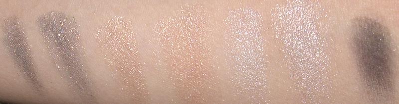
Left to right: 1 Blast of Blue/9 Rock Sand/10 Airy Jade/ 13 Black

Here are my dry swatches. Each color is swatched twice with slight different intensity, other than #13 black which is swatched once.  I didn't swatch these wet, but when swatched wet the colors are very intense.
I hardly ever use my eyeshadows wet so that's not very realistic for me.


#01 Blast of blue is a blue with gold pigments, it swatches more like a complex grey-navy with gold shimmers and flecks. Applied intensely it looks like a darkened grey blue with a gold sheen. It seems to have a more 'flecks' sort of consistency than shimmers when used dry.


#09 Rock Sand is a shimmery beigey peach. Very similar to Chanel illusion ombre #82 emerville. I wouldn't think you'd need both shades.

#10 Airy Jade is an icy, frosty blue shimmer. It looks quite frosty when applied wet and almost white.

#13 is a patent black, it looks patent black when used wet. However when dry it looks like an ordinary black charcoal and sort of lacks pigmentation. (When used heavily or wet it's very, very black though). It's the less crumbly and more powdery out of the 4.


Here are each shade on their own:
#01 Blast of Blue

#09 Rock Sand:

#10 Airy Jade


#13 Black 


 Overall 4/5.
Again, not a fan of individual eyeshadows and given the consistency and intensity of these shades when applied more heavily, this is A LOT of product and I wish they can somehow make it into a palette with smaller size so you can try more shades.

They retail for a whopping 32USD each too, which kind of takes the fun out of buying individual shades.

However the finish and pigmentation is revolutionary- I know a lot of brands have came out with loose pigment eyeshadows lately but these are a lot more practical. They are not so loose that they fall everywhere when applied, and the jar packaging with the pressed consistency means they are a lot more portable too.

2011-09-01

Fancl Massage & Lift Cream review

Fancl Massage & Lift cream is supposedly limited edition from 2011. It comes in a pretty pink box with tiara prints on both the box and the product tube. The tube contains 50g of products.

The massage lift cream is a whoel new category of skincare altogether- they are facial massage creams , not intended to be left on the face as a normal moisturiser, or just sit on your face like a facial mask.
 
The instructions says to massage into face and neck area, it moisturisers and improves blood and lymph circulation, leaves skin supple, lustrous and resilient.

Application instruction: after cleansing your face, while face is still lightly damp, take 2 cherry sized amount dollops on your face, then massage with fingers tips over your face and neck in circular motion for a few minutes. Then rinse with warm water lightly, and follow with your normal moisturisers.


Comes in a screw top cap and opening looks like this.


The massage cream is like a light moisturiser consistency, it does contain some essential oil base which means it's very mildly fragranced. However it does not massage out to feel oily on the skin. Instead massaging your face with this feels like just rubbing a light fluffy moisturisers around, it doesn't emulsify or do anything like miraculous foaming or feels tingly on the skin or anything like that.

I usually apply a bit less than recommended dose (like maybe just 1 cherry size), after I clean my face in the shower (with Fancl cleansing oil and any foaming face wash), then I massage this in for a good 3 minutes, then I leave it on the face while I wash my hair or scrub my body etc.  Then I rinse it off with warm water (do not follow with another face cleanser or toner). It doesn't hurt to not rinse it for ages as I feel whatever's in the massage cream wouldn't hurt too much when left on your skin for a bit longer. (Though I've tried this as overnight moisturiser, it's probably a bit too rich and not meant to be used that way).


It leaves my skin sort of lightly hydrated and feeling very supple afterwards. The next day I do feel less puffyness to my face as well.

It's interesting because I know some people would probably think this is a useless product, but honestly massages help your face in terms of lifting and getting rid of that tired look or puffed up face from excess water retention. A lot of Japanese beauty magazines dedicate a special chapter at times to talk about various massage techniques. I don't follow much technique but just generally massage in circular motion lightly with finger tips, focusing on areas I want to "lift". (e.g. I get a bit of puffy face and eyes when I'm tired).

After:

Overall I do like this product, it's not a huge hassel to use, and the waiting time means I can just wash my hair inbetween or something, so it's not like I have to wait around for extra 15-20 minutes like a facial mask.

Definitely will be a hit or miss item for most people I believe. Suitable for those who actually enjoy a variety of skincare and would have time to incorporate some massage into their skincare regime.

You will not notice an immediate difference like some facial masks do, but a very slight gradual improvement to your overall firmness of skin and help with puffyness.

Overall rating 4/5.

Sofina Beaute Day Protector II SPF24 PA+++ moisturising sunscreen review/ swatch

Carrying on from my last post, here's the Sofina Beaute Day Protector II (again, Sofina moisturisers go by codes, I for oily skin, II for combo/normal, III for dry skin, sometimes some lines has IV for very dry skin).

This is the SPF24 PA +++ version (the earlier one I reviewed was SPF50). The product is marketed as a moisturiser/ sunscreen in one.

Unlike the SPF50 version which comes in a hard plastic bottle, this one comes in a beautiful elongated tube, which is still very easy to use and the soft squeeze tube means quantity control is very easy.

Contains 32g of product, which would easily last for a few months when using just for the face.

The SPF24 PA+++ version is meant for winter/ spring, when the UV needs are a bit less. It is also a bit more creamy and moisturising than the SPF50 version.


The instruction says use after toners during the day. Recommended usage is about 1.5cm size for full face, and the tube should last for 2.5 months with regular use. (I would say I definitely get more than 2.5 months use out of this, which could mean I'm not using enough sunscreen).


Here's the tube nozzle, again it's a fine nozzle and very easy to control.


Here's the product, if you compare it to my previous post to the SPF50 version, this one is slightly creamier and not as runny. I actually love the consistency of this one for winter. It's not super rich or nourishing but instead it just feels so soft and mild on my skin. It also seems to moisturise more than SPF50 version (which is intended as the SPF50 is for summer and when your skin probably prefers less rich products).


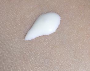
The middle is product on its own, on the left is when lightly blended out, and on the right is fully blended.


You can see from the very right swatch, it spreads so easily and evenly, looks slightly dewy on my skin only because I didn't blend it completely. On the face it disappears very quickly and you will not get a noticeably shine or anything.

Under makeup this still sits very well, just because it's more nourishing than the SPF50 versoin doesn't seem to make this one slip and slide on my face like a lot of moisturisers tend to (I have issues with my moisturisers being too rich and melting my makeup or make me look oily by mid day). Not with this one.

Overall 5/5. Would gladly repurchase this. Almost wish there's a SPF50 version in this consistency even for winter use.