Showing posts with label OPI. Show all posts

2012-10-16

OPI You Callin' Me A Lyre? NL T51 NYC Ballet Soft Shades swatch/ review

OPI NYC Ballet Soft shades (2012 spring collection) was a collection of nude ivory/ peaches and pinks collection. They are truely very ballet shades or bridal nail color sort of selection.

I picked "You Callin' Me A Lyre" since it seemed like a safe color, without being too nude and bandaid like.

In the bottle it looks like a ivory pink with a hint of peach. Very pale though.


You can see there's no shimmers or pearliness or glitters etc, it's just a milky gloss.


Here it is with 2 coats. These are like day 4 of wear actually since I couldn't find my camera first few days. so they held up rather well. Unfortunately I didn't do a too good job waiting for it to dry slightly between coats so it was a bit uneven on a few tips. 


Nevertheless you can see what the color is like under different lighting- it's basically a ivory white and some angles you get slightly more of that pink base - but the peach base is non-existent on me. I really can't think of many nicer things to say about this shade since it's such a 'safe' color, it's those shades that makes your nails look nice and glossy, but it doesn't take any attention away from the rest of your outfit.


I'm currently about two shades more tanned than normal since I just came back from holidays so under yellow lights it can look a bit too pale. The difference between this shade and other OPI previous nude shade is that it seems to be a bit more glossy and more 'jelly' finish, it is still uneven with 1 coat so 2 coat is minimum, but I can see it still looking pretty with 3 coats.

Overall 3.5/5 , it's nice but I feel I have plenty more shades like this...

2012-09-04

OPI Isn't That Precious? NL H36 Pink Collection 2010 review/ swatch

OPI Isn't That Precious? is from 2010 Pink Collection, released along with other pastel/ nude/ french sort of shades.

In the bottle it looks like a standard OPI sheer pink shade- I can't think of any real special words to describe it- it's sort of a very generic looking shade in the bottle- soft pink, nude pink creme etc. There's no shimmer / iridescence or glimmer to it.


Below are swatches with 2 coats, with seche vite top coat. I was still rather pale when I took these photos (just spent 3 full weeks under the sun so you can see I'm a lot more tanned in the Orbis nail swatch photos in the last post!) 


Unfortunately this is those OPI shades that needs a bit more love and care on application to ensure smooth finish. You can see the visible streaky or uneveness on some tips. I think to get a really nice finish, you need about 3 coats.


Overall on the tips it makes a lovely nude pink shade, it looks really 'clean' against my pale skin.  It applies paler than it looks in the bottle, since it is a jellyish creme finish. It doesn't build to full opacity but has this nice glossiness to it which makes it not as flat looking as many other french nude pink shades.

Rating is 4/5. It's a lovely basic pink shade, if you love nude pinks you'd like this too. Just requires a bit more care and careful application.


2012-05-25

OPI Pedal Faster Suzi (Holland collection) NL H60 nail lacquer polish review/ swatch

Here's a review of a more recent OPI polish- from the Holland Collection called "Pedal Faster Suzi". OPI website describes it as a shimmery pink lavender- which is exactly what it looked in the bottle, mostly pink with a touch of lilac.


I actually purchased two bottles from the Holland collection, the other bottle shattered during transit and went all over this bottle so it took me ages to clean this bottle up =(


In the bottle it does look like a shimmery pink, like a candy pink but without the neon factor, it's still rather soft but not too pale to be totally pastel.


On my nails it's a light to medium candy pink with lilac undertone and dense but very fine silvery shimmers (but not dense enough to be a foiled finish in my books), which makes the color rather neutral or cool toned. The underlying color base is a creme finish so it applies quite opaque in 2 coats.

Generally mauve/ purple shades do not necessarily look good on me since I think on Asian skin it brings out a lot of the sallow yellow undertone and it can look a bit dirty/ tacky on the finger tips.


Swatches below all with 2 coats (no top coat applied yet).


OPI Cherry blossom is in picture below which I think is more flattering at least on me. It's still a neutral pink but without the lilac base in OPI Pedal Faster Suzi. However that being said, Pedal Faster Suzi is quite a unique shade- I do not have anything similar in my collection of OPI, Essie, Chanel or most Japanese brand polishes I have.

OPI Cherry Blossom has less of a 'creme' base color and a tinge deeper pink and no lilac or lavender base at all. I do not consider them to be that similar but this is about as close a shade as I can think of. And you can see by contrast my skintone looks a lot more fairer with Cherry Blossom, as opposed to Pedal Faster Suzi.


Overall 3/5 for Pedal Faster Suzi. It's just a touch too candy pink to be an office friendly color for me (especially when I'm in suits and formal shirts).


2012-03-08

OPI Nantucket Mist NL S26 Nail Polish colour review/ swatch

It's sort of getting cooler in Sydney by the day, I decided to wear a more spring shade while there's still a bit of sun left.

Here's OPI Nantucket Mist, which has been around for a while. It looks like a mid tone dusty rose with a touch of peach or coral in the bottle.


Code for this shade is NL S26.


Here it is on the nails, 2 coats and no topcoat yet. I applied a slightly more generous amount for each coat, given it's a creme finish so if you apply too thinly, it can look streaky and go uneven on the nails.

Two coats gave beautiful, almost full coverage (under the lights if I hold up my nails to the sun I can see my tips just showing through very slightly). It's a true creme, glossy finish, no shimmers or pearling or iridescence. Once I added my usual seche vite topcoat the finish looks like those gel nails- almost glazed finish.

Picture below is as dark as it can look under certain lights (seems darker in direct sunlight). The color on the nails is a medium nude corally rosy pink, it's got that peach or coral mix to it that lifts it away from yet another boring medium pink or plain rose pink color.

Here's as light as it can look under certain lights.


Here it looks a bit lighter under different lighting again- which will show almost like a yummy candy pink. The shade is very soft and wearable and definitely great for the office. I'm in a rather happy mood wearing this today.


Overall 5/5. Would love more OPI shades similar to this.

2011-12-16

OPI DS Reflection DS 030 Nail Lacquer polish review/ swatch

Honestly I always surprise myself when I try to clean up my stash...I discovered like literally a whole small box of OPIs I bought earlier but just forgot about! So this week I'll try to swatch more OPIs.

OPI Design Series are like the premium lines from OPI polishes featuring a more unique finish- e.g. holographic, or intensely shimmery. They are identifiable by the silver handle.

I'm reviewing DS Reflection (color code DS 030).

In the bottle it looks like a shimmering red, the shimmers are visibly denser than most other "shimmery" polishes out there. The shimmers are like a soft gold (but being in a red polish means they appear more red gold).


Here are my nail swatches (indoor flash light). It's neutral/ cool toned which means it makes my hands look rather pale. I didn't add a top coat over this but you can see there's a decent gloss. It's not super glossy though- however the shimmers sort of enhance the low-key gloss factor and make it look rather glossy from a distance even without top coat.

It looks more glowy in my picture than in real life.


Once on the hands it's more like a pinky red, it's not pink by any means, but not deep enough to be a true red. I think pic below is more realistic shade indoors. I'm wearing 2 coats. The DS polishes are incredibly pigmented and denser in shimmer which makes application such a dream. It just glides on. (The DS polishes comes with the pro-wide brushes). On the nails the gold shimmers just sort of sparkle. The shimmers are really fine but doesn't quite turn the finish into a sparkly foil finish (e.g. OPI Hollywood blonde).


Here's a picture under the sun (no flash). Sorry for the dry hand, I was doing a lot of housework!
You can see under the sunlight the shimmers actually shine in a sort of slightly blue tinge- I think it reflects differently under different lights.


Overall 4/5. It's sort of pretty and festive for Christmas , but not spectacular.

2011-12-15

OPI Heart Throb Nail Lacquer NL H18 swatch/ review

OPI Heart Throb Nail Lacquer (code NL H18) was released at least before 2010 and seems to continue to be part of the regular collection.

In the bottle it's a milky/ cloudy pink, a bit of a strawberry milkshake pink color. There's definitely that creaminess to it, but it's not opaque or full creme (or mod pink looking).


Here's the swatch with 2 coats on the nail, given its cloudy base I thought I'd layer it on top of a whitish base coat (used Maquillage nail base coat which is nothing much to rave about, Nailtek Foundation II will give an equally slightly white base and finish). As it expected it brought out the creamy base a bit more and gives a more opaque finish.


Overall it's a soft, strawberry milk shake pink, you will need at least 2 coats for an even coverage otherwise it can look uneven and streaky. I didn't try 3 coats as it might look a bit more "mod pink" which isn't something I like.

The pink base is prominent enough to show up as a proper pink instead of like a lot of OPI/ Essie soft pink nudes where you get more ivory pink than actual pink. It's a true soft pink without beige tones or peach tones etc. Just a very cute girly pink.

Still an office friendly color. You can see from the bottle I've used it quite a few times- it's sort of a no brain color that I can reach easily for my work days.

Overall 4/5. It's unique in that it gives a true strawberry milkshake pink without losing the pink base or become too translucent like a lot of other pinks tend to be. I actually prefer the look of it the last few times I wore it over a clear base coat, it gives more 'natural look' to it than using a whitish base coat which is bringing out a lot of the creamy base.

2011-08-10

OPI Yokohama Collection Full review/ swatch (Cherry blossom, Pinkerbell, Super Bright, Swirl etc)

OPI Yokohama was a really limited edition collection in Asia in around 2009? or 2010 thereabouts.

I was so excited to see the collection that in the first time in ages, I actually just ordered every single color in the collection! It contains the following 12 bottles of shades:

Y01 Baby Blue
Y28 Pinkerbell
Y31 Super Bright Sparkles 2
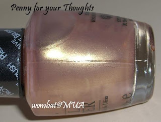
Y32 Penny For Your Thoughts
Y33 Blush of Adrenaline
Y35 Vintage Violet
Y36 Swirl of Euphoria
Y43 Bay Bridge Sunset
Y44 Cherry Blossom
Y45 I Love Yokohama
Y46 Sweet Love At Ferris Wheel
Y47 Yokohama Twilight


 Here are most of them lined up (click on picture to enlarge).


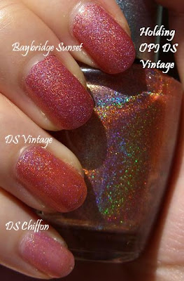
Some comparision between Baybridge Sunset and OPI Design Series DS Vintage (they are virtually the same, even though DS vintage seems more rainbowy in the bottle, they are about the same on the nails. You really don't need both shades). It's a sparkly corally red bronze that flashes all different lights at different angles, holo finish.


I also threw in OPI Design Series DS Chiffon and swatch as a comparison:


Then my FAVORITE color from this collection! "I Love Yokohama" swatched below. How pretty is this!  It's a very fine foiled finish beigey pink, that makes my nails look so clean and elegant.


This is "Cherry Blossom" swatched below, again it's almost a foiled finish, sparkly shimmery cherry blossom pink, very feminine. It reminds me of a few Chanel softshades (other than Chanels don't do the foiled finish in any pinks as far as I can remember!).

OPI Vintage Violet below: this was slightly meh for me. It's a frosty, very pale silvery lilac. From a distance it can look almost just a washed out silver, the lilac tinge is very light. I don't like frost finishes as any brush strokes show very easily. For an OPI frost finish I prefer OPI Tutti Fruitti Tonga , which is more like a pearl/ frost and much prettier and softer looking than Vintage Violet, other than it's a pearly pink tinge.


Here are close up pics of the other shades:


 Overall 5/5 for this collection. They are such an interesting mix of different finishes and my favorite soft colors with a twist.

 Obviously this particular post has taken a ridiculous amount of time so would love to hear any comments! I will gradually upload other swatches for other shades when I get around to it =)

As to availability of this collection, sorry I really don't know- it seems some websites are selling it or on ebay, I asked a friend to buy it in HK for me when it first came out. For a while it was selling in Australia too (David Jones) but I suspect it's now gone.