Showing posts with label Essie. Show all posts

2012-03-05

Essie Van D'Go #710 Spring 2010 nail polish review/ swatch

I've been pretty behind with these few years of Essies and OPIs and I only really buy them when I see my familiar sellers have some items up, not necessarily for cheap by USD RRP prices but certainly cheaper once I factor in shipping etc. ( I wish there was still cheap OPIs and Essies around on those transdesign or 8ty8beauty websites...)

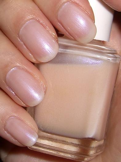
Here's Essie Van D'Go, from spring 2010 collection. From all the websites and online swatches I thought I was going to get a pastel or medium peachy pink creme, which is my usual colors for the office days. In the bottle it does look like yet another Essie nudes or pales.


Well I was really surprised, in a not so pleasant way. I got a quite opaque full creme finish barbie pale pink shade once applied. Of course if you are looking for this exact color it'd be great, but I was in a bit of a shock once I saw the finished look. It's just too opaque and too full creme and way too stark on me. If you know those mod whites etc type of shade which looks like liquid paper on your tips, this looks like a pink liquid paper.

I had two coats on all fingers other than my index finger (finger on the very right of pic) which has a slightly thicker 2nd coat- you can see the pink base is even stronger. If you just wear one coat it's uneven and does not spread properly, a bit paint-like.


No flash, indoor light just to show you how it can look a bit stark on the fingers. The flash photography in the last few pics truely made the color look nicer than it was.


For me the color was a true barbie pastel pink, I saw a lot of online swatches where it was leaning towards a peachy look, I'm going to guess it varies a bit with your skintone, but for my skin color (usually 2nd lightest foundation shade or the lightest shade) it's just way too stark and strange looking.

I promptly removed it on day 2. Dear bf saw me putting it on and he didn't say anything but he clearly had the look of (wow that's not a good color).

The overall consistency of this polish is also quite disappointing, it's very liquidpaper-like! Although most flaws are masked with 2 coats, it still lacks a glossyness to it so it looks rather flat on the finger.  My personal rating for it is 1 out of 5. I really want my $10AUD back (yes that's how much they cost in Australia now even when you find it on sale.....which is about 10.50USD at today's exchange rate). Maybe if work has a christmas party with the 70s theme or austin powers I could bring this out. hrrmph...

2012-02-20

Essie Not Just A Pretty Face #690 nail lacquer polish review/ swatch

Here's a review of Essie Not Just  A Prety Face.I've been giving my nails a bit of a rest for last 2 weeks just to grow them back to healthy condition a bit, hence the lack of nail reviews lately.

Essie Not Just A Pretty Face looks like a nude pink with a slight mauve undertone in the bottle. I thought it looks a bit like Essie Innocent  I reviewed previously. However I think Not Just A Pretty Face is a bit paler in shade.


On the nails with 2 coats and no top or base coat below (was in a hurry this morning lol).
It goes on the nail surprisingly on the lighter side, the consistency was a bit annoying as it looked really uneven with 1 coat and 2 coats still looked uneven, but once it dried it looks way better.   It's a true semi translucent creme shade, does not build to full opacity until 3 coats, but 2 coats give a nice coverage already. There's no shimmers or iridescence inside. I would call this a "cloudy creme" as the pigmentation in the polish seemed uneven hence it applies blotchy.


On the nails it's a soft pink nude shade, in a lot of Asian blog reviews they tend to review nailpolishes based on whether it makes your hand look "paler" or slimmer etc, once I had this color on I actually thought this shade brings out a bit of sallowness in your skintone, especially if you are Asian- I think the very slight mauvey undertone just brings out the yellowness in the skin.

However overall it's still a pretty shade- there is virtually no mauve or purple base once applied to the nails. Essie Innocent is a darker and slightly more pink version of this and with an extra tiny bit of mauve.


Overall 3.5/5. It's a nice office shade but not exactly special. I also found the consistency not so nice and application felt blotchy- maybe if I use my usual base coats it might look better.

2011-09-26

Essie Anniversary Gala #562 Nail Polish Lacquer review/ swatch

Essie Anniversary Gala (code 562)  is a pearly pink (with slightest hint of peach- not sure whether the peachiness comes from my natural nail color or from the polish itself though), semi opaque finish polish, which flashes a touch of firefly green and at some angles, slightly white/yellow flash.


Not sure how many people have seen firefly in real life, but they flicker with a very gentle, slightly green and yellow tinged light in the dark, at least in Taiwan. (In NZ I remember they looked just yellow).

It's a very very soft green flash, that doesn't standout glaringly.  It adds a touch of cool-toned feel to the polish but overall shade I would call it neutral.

I had to tilt the bottle to show the sligtht green flash , see the top of the picture it captures a little bit of green.


It's semi opaque so probably need 2 coats or 3 for the pink base to show up. It will never build up to full opacity. Depends on which base coat you wear, you can manipulate the finish of this.


Here's 2 coats on the nails- on the middle and index finger I did a 3 coat but turned it a bit goopy and uneven =(  However it seems 2 coats is sufficient to build up the pink color base, without going to 3 coats.


You can see how it's a pearly finish- however it's sort of not a full pearl, the shimmers are just a bit larger than a normal pearl finish which means when applied not carefully enough, it can look a bit streaky or uneven.


I'm wearing Seche Vite base coat which is a slightly opaque white pearl. So it enhances the pearliness of Anniversary Gala and hides my natural nail tip white a little bit and brings out the pink base more as well. In the bottle above you can see the pink base much more clearly.

Overall I'm not sure what I really feel about this shade- it's unique enough for me to keep and obviously I've worn it at least 4-5 times judging by how much is left in the bottle (which is rare for me! I have so many it's hard for me to go back to same shade like 5 times).

Overall 3.5 or 4/5. It's a gorgeous pearly pink with a flash of green/gold shade, however wish the pearlised pigments/shimmers were finer (like OPI Tutti Fruitti Tonga would be nice- bytheway this a a fair bit pinker than Tutti Fruitti Tonga and totally different), the consistency would also be improved as it can look streaky even with careful application, and does not seem to dry fast at all.

2011-09-16

Essie Nail Polish Lady Like - review/ swatch

Essie Ladylike is from 2011 Fall collection. Honestly I think this color has became the new trendy nail color for fall in the past 12 months or something- a bit of mauve, some taupe, some grey, usually in a pretty opaque creme finish . Reminds me of the taupey-grey-lilac color from the OPI France collection too.

After my positive experience with a color in this territory from UNT LJ040 Tipsy Nail Polish , I thought I might like this one too.

Here it is- in the bottom Ladylike looks like a pale taupe lilac with some nude undertone in a full creme. That's what it looks like on the nails too. This shade is surprisingly fully pigmented for a creme finish polish.

Here's the swatch- looks just like in the bottle. It's a full creme opaque finish- I got this coverage with 2 coats. (Sorry about the fluff on one of the nails!)

Under a few different lights: It looks a bit like one of those 'mod' shades, but it's not. It doesn't have that really stark full creme look of some mod shades that look out of place.


Here's as dark as it can look under certain lights. This is probably where this polish disappointed me a bit- it's not pale and soft enough for an elegant taupy-nude lilac, but it's not dark enough to be a full autumn shade.

I much prefer UNT nail polish in LJ040 , I've attached 2 pictures below- you can see the UNT LJ040 Tipsy shade is a paler and has a pearly finish. Looks far more understated than Essie Ladylike.


Obviously whether you would like Essie Ladylike or not will largely depend on your undertone. That being said, Essie Ladylike probably one of the very few purple/lilac family I could ever wear without feeling totally out of place. I can probably even get away with wearing it in the office (but definitely not going to clients with this). If you want something paler I would definitely suggest UNT LJ040 Tipsy.

Essie Ladylike is probably one of those shades you should swatch before you buy. Also, as mentioned previously, I've really noticed how most guys don't like these 'interesting' shades, they just call it the yuck color, lol. I suppose the more nailpolishes you have and tried the more adventurous you get in trying new colors. (Though I still rarely ever wear any of my greens and blues).

Lastly, there is something very odd about the consistency of this one. It applies very smooth for a creme shade- but there is just something funny about the consistency- over my Paul & Joe base coat (not sure whether it's caused by the base coat or this), sometimes on some fingers this applies as a thin unpigmented layer, but sometimes it feels very fluidlike and applies a thick pigmented layer. I tried to shake the bottle to mix it but still noticed this. Interesting. Didn't affect my application much but just in case anyone else notices it...

Overall rating 3.5/5.

2011-07-25

Essie Your Hut or Mine Nail Lacquer Polish swatch/ review

Essie Your Hut or Mine is from 2011 collection.
It's a medium creamy rose with a very subtle, fine shimmer- from a distance it is still creme looking.


On the nails it makes a rosy pink- very pretty, I didn't expect to like this color, but the finish and opacity is very impressive and high quality, surpassing a lot of the previous Essie polishes I've used before. It applies smoothly, the color is rich and luscious. It's such a gorgeous spring/summer rosy pink mid tone color. And the shimmer is subtle and beautiful.


This is about as dark as it can look under different lighting:


Here it is after 2 days, outdoor sunlight:


Overall 5/5. I stopped collecting as much Essie about 1 year ago because I found Essie releases a lot of similar shades (espeiclaly in the nude/ pink family), however this has rekindled my love for Essie!

2011-07-14

Essie Bootleg #519 Nail Polish swatch/review (#543 My Private Cabana, #383 Innocent comparison)

Essie Bootleg is a medium mauve pink, or a dusty pale rose creme on the nails, it applies opaque with 2 coats.


Here's the bottle comparison to other Essie mid tones or pale shades, #543 My Private Cabana  (detailed review here http://blushed-wombat.blogspot.com/search/label/Essie ) and #383 Innocent.


Bootleg is clearly more pink once compared to Innocent, which is a bit more beige nude based. While my private cabana just looks like a usual french pink creme in comparison (it's more jelly like and not as opaque).

Essie Innocent is a pink pearly nude. Again I'm wearing 2 coats on all colosr below:


Overall I like all 3 shades for soft pinks or mid-tones with a slight twist. Probably like Innocent the best because it's suits me more as a french nude. They are all pretty office friendly colors. Consistency and wear is the same between all 3.

2011-07-06

Essie My Private Cabana Nail Polish Review/ Swatch

Essie My Private Cabana is a semi translucent creme color that can build up to quite an opaque creme. However it is not opaque enough to make it a stark creme color, instead it's a neutral, pretty pale pink, a bit like those pale pink carnation petales. It doesn't have shimmers or glitters, but it's got a good consistency so it doesn't look uneven.

Essie makes a lot of sheers and nudes but this one I definitely like more than some others, because it applies without streaks and the color is very wearable, especially for the office.


Overall 5/5 , no complaints at all. I'm wearing two coats with seche vite top coat.

2011-06-30

Essie Vanity Fairest #505 Nail Polish swatch/review

Essie Vanity Fairest (code 505) is a vanilla white, actually it is very much like the OPI I'll take the cake which I just reviewed below, in the same base color.  However it doesn't have the gold shimmer in OPI I'll take the cake, instead it's slightly more opaque and milky (but it's not a full creme), with very subtle and delicate white silver shimmers.


It looks my nails look really clean. It's a lovely office color. However when I'm a bit more tanned, I do not like this as a french mani color, as it can be just too 'white' and not quite natural enough.


On my paler days it does look so polished, clean and pretty.


Here it is under warmer lights- you can see how subtle the tiny tiny white silver shimmers are. Barely picking it up in photos.


Again, 2 coats in pictures above.

Overall rating 4/5 .
Not the 'necessary' best french nude colors there, but it is pretty and a good way to start into Essie french colors.

2010-08-26

Essie Sold Out Show #390 Nail Polish Review/ Swatch

Essie Sold Out Show (code #390) Nail Polish was definitely one of my earlier Essie polish purchases from a while. Using this I was definitely reminded when I first got into nailpolishes, I often felt the (older collections of) Essie formulation in sheer/ french shades were generally inferior to OPI in terms of colors and finishes.

However, Sold Out Show was a pretty decent one in terms of color and finish. It does has a stronger nailpolish smell that is slightly irritating for the nose, the smell has obviously improved over the years with Essie.

This is probably as good as I could capture the Sold Out Show shade. You can see in a predominantly ivory base (with a tiny hint of pink), there's this pearly/ opal glow. The glow is slightly lavender and slightly silvery. Very very subtle.


Here are many nail swatches- Sold Out Show is basically an ivory french color with a slight pink touch, but it is way more ivory than pink. The ivory is also a soft ivory, not a stark white base.  The finish is a sheer transparent pearl with an opal flash (which makes this a neutral or cool toned shade) that can be built up for more opacity, but never completely creme.


Here under a slightly different lighting it's clearly more ivory/white than pink.


Overall 4/5. It's a pleasant, safe ivory pearly shade with an opal flash. It is one of those 'clean' looking shades. However would require a good application of 2-3 coats to ensure no streakiness. Would like more opacity in this shade as a true ivory pearl with opal flash in more opacity would certainly be stunning.

I love french shades and pastel colors but would not say this is on my 'must have Essies' list.